
StoryBrand Website Examples That Convert
Want to see real StoryBrand website examples that actually work? As an Adelaide business coach who built a six-figure SaaS company, I blend StoryBrand frameworks with intuitive practices like meditation to create clarity and connection. I learned the hard way that pretty websites don’t pay bills. Let me show you what happened when I discovered this expensive truth – and how it transformed not just my business, but my entire approach to messaging.
The Six Figure SaaS Messaging Problem: A StoryBrand Success Story
StoryBrand Website Transformation Results:
- 2016: Initial launch - Beautiful but not converting (29 customers at $29 AUD/year)
- 2017: Mass Challenge evolution - Corporate messaging pivot
- 2018: Data-driven growth - 4,401 PD hours, 247 organizations
- 2021: StoryBrand implementation - Six-figure revenue achieved
Website Messaging Example #1: The Feature Focus (2016)
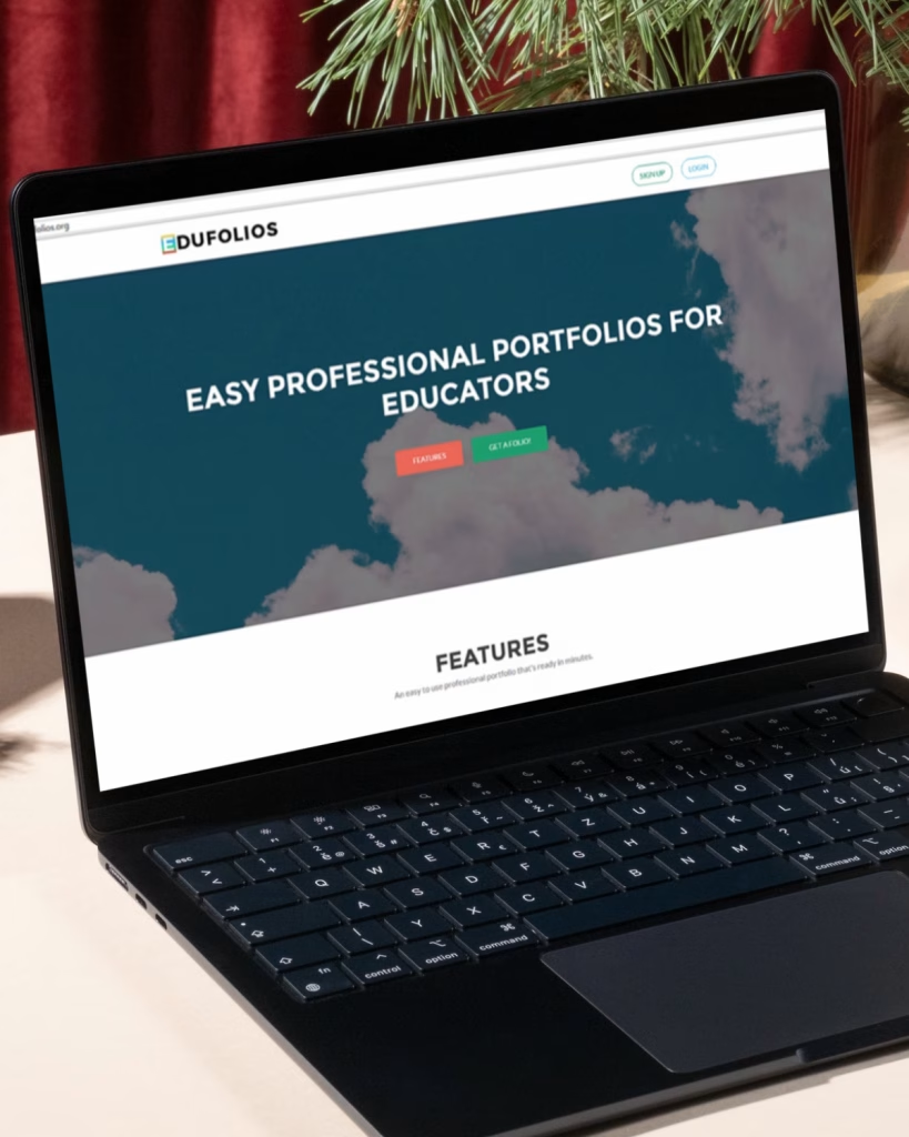
Picture this: It’s 2016, and our first Edufolios website is live. With just 29 brave early adopters paying $29 AUD a year, we had clouds floating across our homepage and a meticulously detailed feature list. I hadn’t heard of StoryBrand yet, I’d never even seen any StoryBrand website examples – I just wanted to present a professional image and get people to sign up! The thing is, because I didn’t know about inviting customers into a story, I focused on what the software could do… not how it helped transform teachers’ lives.
Here in South Australia, business owners often struggle with this same challenge – focusing on features instead of transformation. As a former English teacher, I should have known better about the power of story, but like many business owners, I was stuck in the “look how great our product is” trap instead of showing how we could help solve real problems.
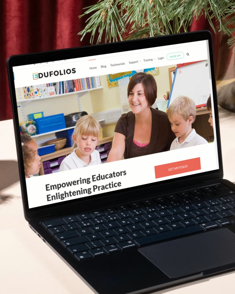
Website Messaging Example #2: The Corporate Pivot
By now, even though I still hadn’t come across any StoryBrand website examples, I’d done countless hours of research, testing different approaches to attracting the teachers who needed our services. That’s my nature – I won’t tell people things I’m not sure about. Each iteration was an honest attempt to better serve our community.
In this version, I’d started to get some things right. Finally, there was a real teacher smiling at the top of the page! But then… we added animated text that looped over it. Let me tell you why that’s a problem: Your potential customer is busy. They’re probably marking papers, planning lessons, or trying to squeeze in professional development between classes. They don’t have time to wait for your clever text animations to reveal your message.
And speaking of messages – “Empowering educators”? It sounds professional, but what does it actually mean? We followed it with a paragraph of explanation that, if I’m honest, NO ONE was ever going to read. It’s a classic case of trying to sound impressive instead of being helpful. Looking back, I can see we were still hiding behind vague corporate language instead of simply saying “We make gathering evidence for teacher rego super easy!” This site… does NOT pass the “grunt test“
Website Messaging Example #3: The Data-Driven Stage (2018)
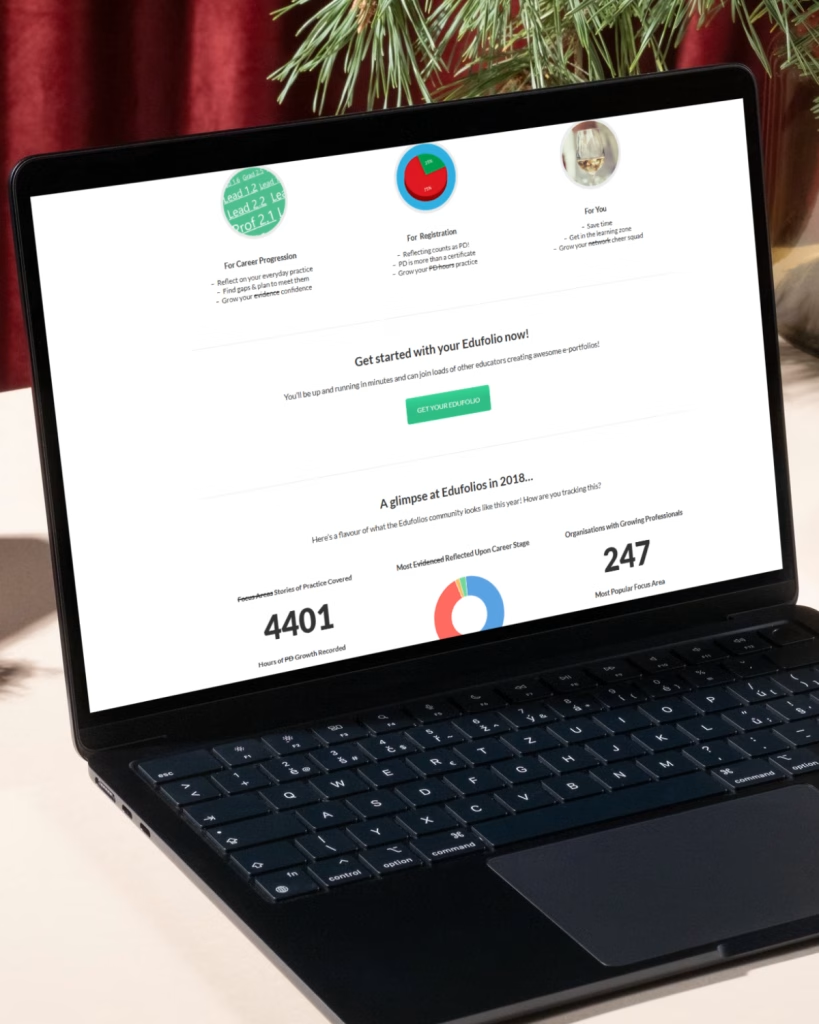
By 2018, we had impressive numbers: 4,401 hours of PD growth recorded, 247 organizations on board. I’d started to experiment with storytelling now. After four years in business, we had real authority – actual stories of teachers transforming their careers through Edufolios. I loved sharing these proof points because, as someone who values trust and contribution, nothing speaks louder than real results.
While the data built credibility, these numbers represented real teachers making real progress – dedicated educators investing time in their professional growth. But here’s where the story gets interesting: we were still missing the emotional connection that would make our message truly resonate.
We weren’t showing we understood the internal struggle our teachers faced: the exhaustion of constantly proving their worth, the uncertainty about career progression, and the pressure to perform while staying passionate about teaching. Numbers tell the what, but they don’t address the why. And in education, just like in business, the ‘why’ is where real transformation happens.
The StoryBrand Website Transformation (2021)
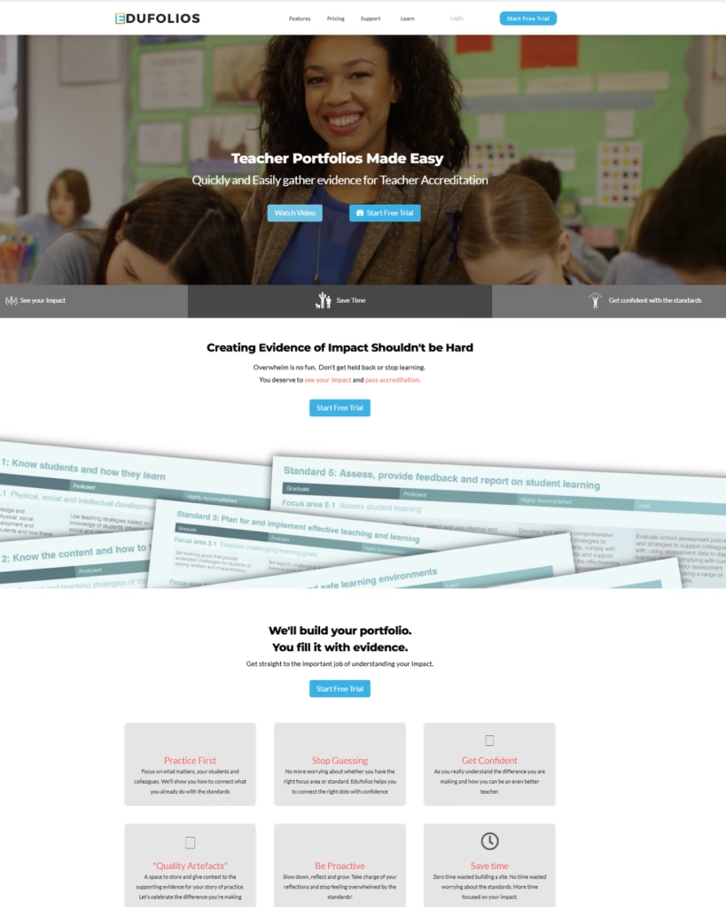
Then I found StoryBrand. It was an unassuming book sitting in QBD, and as a former English teacher, the idea of using story structure to sell and market products instantly resonated. The English teacher in me couldn’t resist… thank goodness!
The StoryBrand framework helped me piece it all together. I explored countless StoryBrand website examples and read Don Miller’s book cover to cover. But here’s what made it truly powerful for me – it wasn’t just about following a formula. It was about understanding the deeper truth of how humans connect through story.
The real breakthrough came when I realized: Your website doesn’t need more features, fancier design, or clever animations. It needs clarity. Because confused customers don’t buy – no matter how many animated clouds, fancy floating text, stats and badges, and other whizz-bang things you have floating across your homepage. What they need is to see themselves in your story and understand how you can help them transform.
Today, as a Business Made Simple Coach combining clarity with intuition, I help other business owners avoid these expensive messaging mistakes. Because here’s what I know to be true: when your message aligns with both strategy and soul, you create something people can trust. You build a business that contributes real value. And most importantly, you attract the aligned clients who need exactly what you offer.
This isn’t just about making your website prettier or following a formula – it’s about creating clarity that serves. It’s about building trust through authentic communication. And it’s about contributing to your clients’ success in a way that lights you up.
Why Message-First Matters: A Website Conversion Case Study
These website messaging examples from our journey show a clear pattern: When your message isn’t clear, you’re paying for a pretty billboard that no one reads. As someone who spent thousands on fancy website features and countless hours tweaking animations (those floating clouds!), I understand the temptation to focus on design first. Here in South Australia, I see business owners make the same expensive mistakes I did – investing in beautiful websites before clarifying their message.
But here’s what my journey from confused startup to six-figure success taught me:
- When your message isn’t clear, you’re paying for a pretty billboard that no one reads
- Every design change without messaging clarity is like rearranging deck chairs on the Titanic
- The most expensive website is the one that looks beautiful but doesn’t convert
Today, as a Business Made Simple Coach combining strategic frameworks with intuitive practices, I help business owners avoid these costly detours. Because I’ve learned that starting with messaging isn’t just about better communication – it’s about saving time, money, and sanity.
Think about it:
- Why pay for multiple website revisions when you haven’t nailed your story?
- Why invest in fancy features before knowing exactly what your customers need to hear?
- Why waste time on endless redesigns when your message isn’t resonating?
Ready to save time and money by getting your message right first?
Ready to take your first step towards message clarity? Download my free “3-Step Magnetic Messaging Formula” and:
- Clarify your message before spending on design
- Attract aligned clients who understand your value
- Transform your website from pretty to profitable.
This is a wonderful starting point to getting clearer on your message. Your message is the one thread that weaves throughout your whole business
Your first step to messaging clarity – discover where you’re stuck and what’s possible